The user experience of OpenID at Relying Party web sites is so important to get right. OpenID is right for your web site’s visitors – no doubt in my mind about that. But we need to make sure it’s very easy for your visitors to use so you don’t lose them when they’ve been pre-wired for the password anti-pattern.
Several big companies like Yahoo and Google have invested a lot of effort into figuring out how to present OpenID in a way that a user that is unfamiliar with OpenID can quickly learn or simply use. The irony is that perhaps the best way to get people using OpenID is to not even tell them that that is what they’re using! The sad truth is that users have been trained to trust web sites and passwords – both bad things. We can’t undo that damage and also convince them that learning OpenID is worth their time at the same time. So instead, webmasters can focus on fixing web sites to avoid the password and individual user account problem using OpenID – without telling the user.
Some years down the road, users may have figured out the underlying protocol, or might not. But who cares, really? How many users put http:// in front of their web addresses but have no idea what it means? There is a lot of power in OpenID that can (currently) only be harnessed if users understand OpenID and how to leverage it. But making this power easier and safer to use will take time. In the meantime, let’s make the parts of it that have been solved from a UX point of view well used so web surfers get used to the right way to do things.
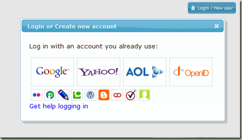
To that end, I’ve been learning JQuery so I can write an optimally easy OpenID login UX (User eXperience). My goal is to add the new UI to the DotNetOpenId/DotNetOpenAuth library in v3.0 or v3.1 so that it’s as easy for relying parties as just dropping in an ASP.NET control to use this super-easy UI. Here’s a screenshot:
It’s absolutely not done yet. And I don’t claim many original elements of this UI. I’ve applied ideas that many other people have been coming up with and sharing with the community. My goal in the shipping version will be to make it simple HTML with CSS that customizes everything so that theming can be applied based on the web site that’s hosting it.
You can download and try out the interactive static HTML preview of this by downloading this zip file and opening up default.html: http://groups.google.com/group/dotnetopenid/web/openidlogin.zip.
I really want to hear your feedback on this. If this does get included in DotNetOpenId/DotNetOpenAuth 3.x, I want to make sure it fits your needs. If you think you’d be interested in an easy way to get this login UX on your web site please try this one out and let me know what you think of it, both good and bad. Send your thoughts to dotnetopenid@googlegroups.com. And drop a penny in the bucket.

best way to get people using OpenID is to not even tell them that that is what they’re using!
Gold words =).
I think its very important to log in cookie user’s choose. If user successfully loged with gooogle id, the next time he shall see googleid promt and a button “back to id selection part”. Such information should be gathered at third site, so it will make the right userid-promt at every site. Simular to anti-spam systems in comments.
How about an ‘ID stack’ option populated with previously used OpenIDs…
agreed with flashr.
waiting for the new version 😉
Thanks for your thoughts. Flashr, regarding your idea about remembering the user’s selection…
Since clicking on the Google button on the UI immediately redirects the user to Google, there's no intermediate UI that might be displayed to the user to make it any shorter. 🙂 Also, how many of you liked the MS Office 2003 feature where less-used menu items were hidden until you clicked the >> icon? Suppose the toolbar buttons were always being re-ordered according to which ones you used most. This would quickly aggravate me (and I suspect others) because I'd have to keep re-learning where to find things. With the UI above, where almost all OpenID Providers are exactly 1-click to redirect, it can't get any shorter, and to re-order buttons to put their last choice in front could potentially be more confusing than helpful.
I think it could be communicated a little better that the user isn’t giving your site their google password, they’re just using their google account to authenticate.
(Also just wanted to say your OpenID provider is a nice bit of code – I’m using it for something I’m working on at the moment).
You wouldn’t have to reorder the selection. Instead you could simply highlight it with a border or color change. This would allow your users see the chose they want to make very quickly. Just my two cents.
I have some code you may be interested in on my website: jQueryOpenIdPlugin You are free to use in your project.
I am developing an app with OpenID login and want to use some of these provider buttons. Where did you get them and what is their license?
command0, the pictures on the buttons come from their respective copyright holders, and their licenses vary. You should contact each Provider to find out if you can use their image on buttons that appear on your web site.